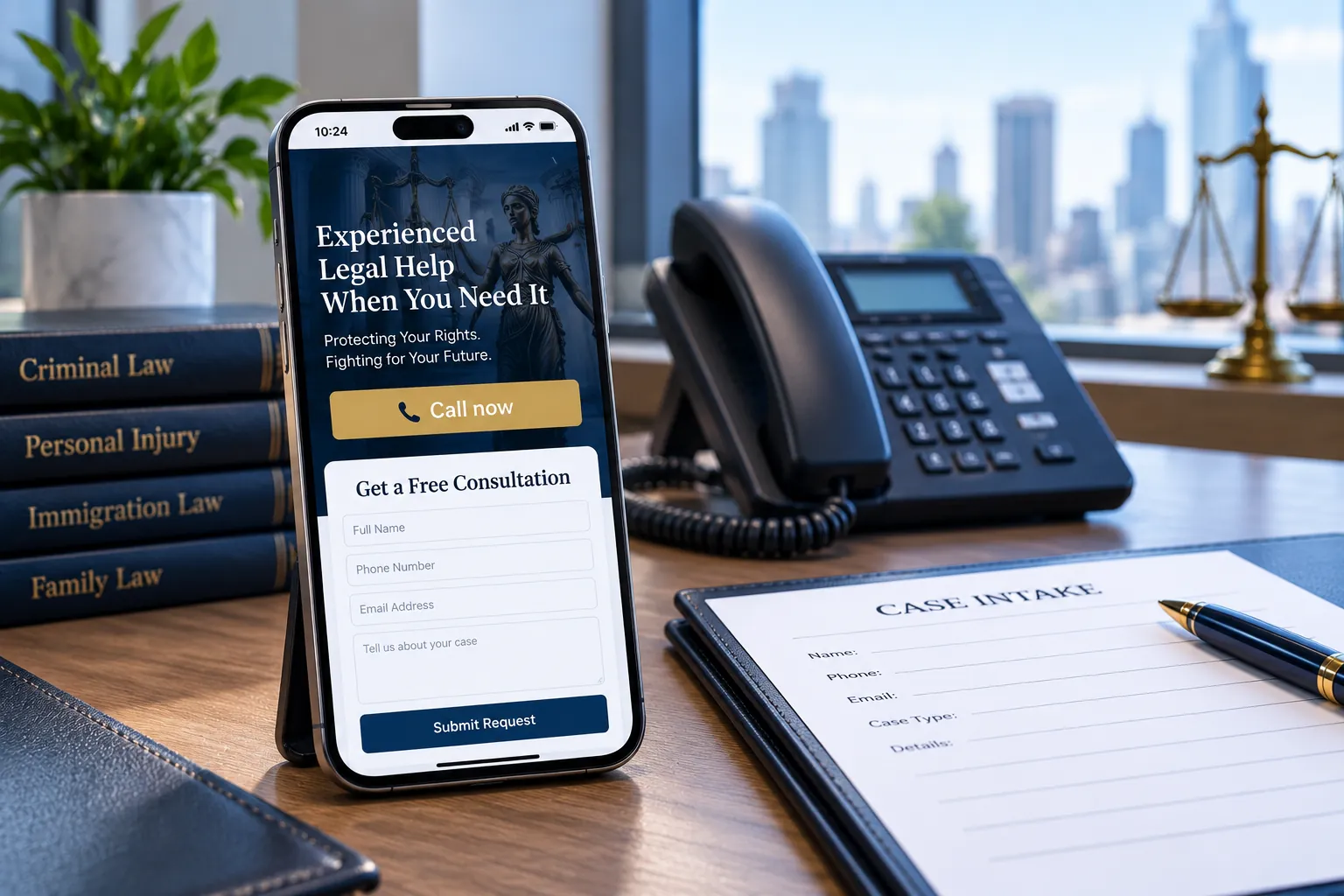

Short answer: a good law firm website is one that gets found, earns trust in the first few seconds and makes contacting the firm easy. In practice that means it loads fast on a phone, shows real lawyers and the case types you handle on the first screen, gives each kind of case its own page, answers the questions clients ask before they call and can be read by Google and the AI engines. A beautiful site that fails any of those is a brochure, not a source of clients.
I'm Ashikur Rahman, founder of Proximity Ranker. I build websites and run SEO and AI search for law firms, and I have legal training (an LL.B and an LL.M), which helps me read a firm's site the way its clients and the search engines both read it. One new New York law firm site I worked on earned 104,000 impressions on Google in its first three months; the dashboard is on my case studies page. Below is the check I run on every firm's site, written so you can run it on yours. If you want to know how the design should change by practice area, or whether to build on WordPress or custom code, my guide on how a law firm website should be designed covers that.
What are the three jobs of a law firm website?
- Get found: rank on Google for the case types you handle, appear in the map pack's website links, and be readable and citable by ChatGPT, Gemini, Perplexity and Google's AI Overviews.
- Earn trust: prove within seconds that a real firm with real lawyers handles this kind of case, because many visitors are worried, in a hurry and have been let down before.
- Make contact easy: one tap to call, a short form, a booking option, and a fast reply.
Every one of the twelve checks below serves at least one of those jobs. When a site has to be fixed in stages, go in that order: found, trusted, contacted.
How can you check whether your law firm website is good?
1. Does it load fast on a phone?
Google announced in October 2023 that it had finished moving to mobile-first indexing, so the phone version of your site is the version Google judges. Run your homepage and your main case page through PageSpeed Insights. Google's Core Web Vitals targets are a Largest Contentful Paint under 2.5 seconds, Interaction to Next Paint under 200 milliseconds and Cumulative Layout Shift under 0.1. A site that fails on mobile is losing visitors before they read a word.
2. Does the first screen say who you are, what you handle and how to call?
Open the site on your phone, look for five seconds and put it down. Could a stranger say the firm's name, the kinds of cases it takes, roughly where it is and how to reach it? If the first screen is a slogan over a skyline photo, the answer is no.
3. Can visitors see real lawyers?
Every lawyer should have a page with a real photo, their admissions, years in practice, the case types they handle and their education. Name them on the homepage and link to those pages. This is what persuades a nervous visitor, and it's the authorship and expertise signal Google and the AI engines look for on legal topics.
4. Does every case type have its own page?
Count the case types you take, then count the pages that cover them. One practice areas page listing fifteen matters doesn't rank for any of them, doesn't reassure anyone and gives AI engines nothing specific to quote. Each case type you want calls for needs its own page, written for the person who has that problem.
5. Is there proof a stranger can check?
Reviews from your Google profile, case results with dates where you're permitted to publish them, recognitions from bodies people have heard of, and media mentions. Unverifiable claims like best lawyers in town convince nobody and give the engines nothing to confirm.
6. Does it answer the questions people ask before they call?
How your fees work, whether the first consultation costs anything, what happens at the first meeting, what to bring and how quickly you respond. Firms often leave these out because they feel sensitive. They're also the questions clients ask search engines and AI tools most, so a page that answers them plainly gets read, quoted and called.
7. Is contacting the firm one tap away?
A call button visible on every screen of the phone version, a form with as few fields as you can manage and an online booking option if you offer consultations. Ask only for what you need to call back, and keep the details of someone's situation for the consultation itself. Then test it: submit your own form and time how long the reply takes.
8. Are your pages indexed?
Open the Pages report in Google Search Console and run URL Inspection on your homepage and each case page. A page marked Discovered, currently not indexed or Crawled, currently not indexed can't rank or be cited, however good it is. This happens often after a redesign or a change of URLs, and it's invisible unless you look.
9. Can AI crawlers read it?
Load a page with JavaScript switched off in your browser. If the text disappears, the crawlers behind ChatGPT and Claude can't see it either; research by Vercel and MERJ found they download JavaScript but don't run it. Then check robots.txt and your firewall: Cloudflare began blocking known AI crawlers by default on new domains in July 2025.
10. Does it carry structured data?
Structured data is code that tells machines who you are: LegalService for the firm, with its address, phone and hours, and Person for each lawyer. Paste a page into the Schema Markup Validator to see what's there. The markup has to match what's visible on the page.
11. Can you see what the site brings in?
Google Analytics should record calls from the site, form submissions and bookings as key events, and your Business Profile link should be tagged so its visits show separately. If you can't say how many calls the website produced last month, you can't tell whether it's working or what a redesign achieved.
12. Can everyone use it?
Readable text without zooming, strong contrast, descriptive alt text on images, buttons big enough for a thumb, and a site that works with a keyboard and a screen reader. The W3C's Web Content Accessibility Guidelines (WCAG 2.2) set the standard. Lighthouse in Chrome and the free WAVE checker catch the most common problems. Plenty of your visitors are reading on an old phone, in poor light or under stress.
Want me to run all twelve checks on your site?
Get the auditWhat should a law firm fix first on its website?
- First, anything that stops the site being found: unindexed pages, a slow phone version, blocked crawlers or content that only appears after JavaScript runs.
- Second, anything that stops visitors trusting it: no named lawyers, stock photos, no case pages, no proof.
- Third, anything that stops them contacting you: a hidden phone number, a long form, a slow reply.
- Last, the measurement: tracking calls and forms so the next round of changes can be judged on results.
Many sites can be fixed rather than rebuilt. A rebuild makes sense when the site fails several checks at the foundation level, such as speed, indexing and AI readability at once, or when the platform makes every fix slow and expensive.
What does a good law firm website cost?
My law firm websites start at $799 for up to 10 pages ($1,599 up to 25, $2,599 up to 50), paid half before work starts and half at launch. That covers design, development, the content, and full optimization for Google and AI search, and a site bought on its own goes on your hosting with the code yours from the first day. The website is free if you take my $799 a month SEO plan for six months; in that case it runs on my account, connected to your domain, and every file becomes yours after month six.
The SEO plan covers local and on-page SEO, the Google Business Profile, AI search optimization and a monthly report, with the audit, negative review removal and Google Ads management included. The audit on its own is $350 for one office or $550 for two, and it includes these twelve checks. All prices are on the pricing page.
What else do law firm owners ask?
01How often should a law firm redesign its website?
There's no fixed cycle. Redesign when the site fails the foundation checks (speed, indexing, AI readability) and can't be fixed on its current platform, or when the firm's practice has changed enough that the structure no longer fits. A sound site that passes the checks is better improved page by page than rebuilt.
02Should a law firm website show prices?
At least explain how fees work: whether you charge a contingency fee, a flat fee or hourly, and whether the first consultation is free. Clients ask about cost more than almost anything else, and a clear answer builds more trust than silence. Whether to publish exact numbers is a business decision for the firm.
03Does a redesign hurt a law firm's Google rankings?
It can, if URLs change without a redirect from every old address to its new one, or if pages that ranked are dropped. Done carefully, with a one-to-one redirect map and the same or better content, rankings usually hold or improve after a short settling period. Check indexing in Search Console in the weeks after launch.
04Is a template website good enough for a law firm?
A template can be fine for the look. The problem is usually the content: template sites often ship with generic practice pages that read like every other firm's. If you use a template, rewrite every case page for your own clients and make sure it passes the twelve checks, speed and indexing above all.
05Do I need a blog on my law firm website?
Not for its own sake. What you need is pages that answer the questions your clients ask. Some of those fit best on case-type pages and some as guides. A blog of generic posts nobody at the firm has read does nothing for clients, rankings or AI citations.