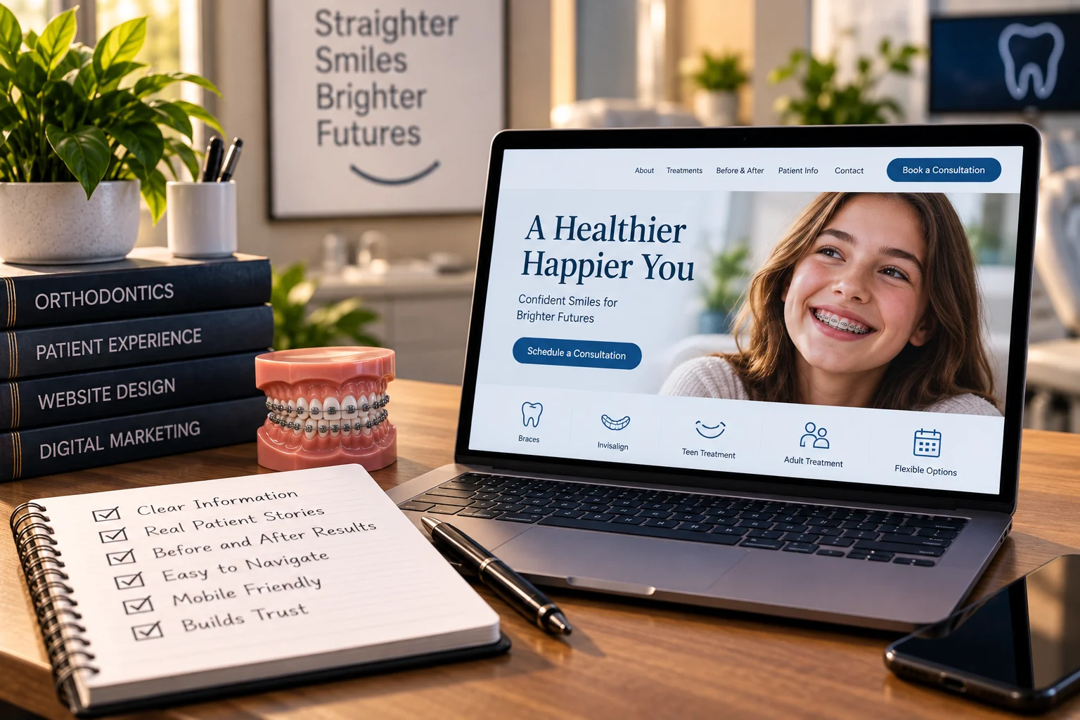
People searching for the best orthodontic websites are usually looking for something to show a designer. That's a reasonable instinct and it produces a bad brief, because the sites that look best in a gallery and the sites that fill a schedule aren't the same sites, and you can't tell them apart by looking.
So rather than a gallery, here are the four decisions that separate them, each one scoreable against your own site. A note before we start: the concept designs on my own site are exactly that, concepts built to demonstrate a layout, not live client practices. I would rather say that plainly than have you assume otherwise.
Decision one: which of the two buyers the homepage is for
An orthodontic practice sells to two people who share almost nothing.
The first is a parent, usually of a child between seven and thirteen, often sent by the family dentist. They aren't deciding whether treatment should happen. They're deciding who does it, and their real questions are scheduling and money: how many appointments, will they be during school hours, what does it cost in total, and will my insurance touch it.
The second is an adult, typically between twenty-five and fifty, considering clear aligners and privately embarrassed about it. They're deciding whether to do this at all, and they're comparing you against a mail-order aligner company that has already quoted them a number on a website with no appointment attached.
The weak version of this homepage tries to speak to both at once and produces something that means nothing to either. The strong version picks a primary audience for the first screen, based on which one the practice actually wants more of, and gives the other a clear, obvious path within one tap. Two doors, one of which is wider.
The adult path in particular needs to answer the comparison nobody says out loud: what an orthodontist does that a mail-order kit doesn't, in terms of supervision, what happens if a tooth doesn't track, and what's being risked. That's a real answer and it's rarely written down.
Decision two: how the money question is handled
This decides more first visits than anything else on the page, and almost every site handles it by hiding.
You don't have to publish a price to answer it. The reader is trying to establish four things: whether the consultation costs anything, whether payment can be spread out, whether insurance is dealt with by you or by them, and roughly what world the number lives in. Three of those four can be answered precisely with no figure at all.
What a good version says: the consultation is free and takes about forty minutes, we take payment plans and here's how a typical one is structured, we bill insurance directly and we will check your benefit before you commit, and the total depends on case complexity and length, which we will tell you at the consultation rather than afterward.
That's transparent without publishing a price, and it removes the specific fear that keeps people from booking, which isn't the cost itself but the suspicion that they will be quoted something after getting emotionally committed.
Want to know how your site answers the money question compared with the practices above you?
Get your free auditDecision three: proof that's yours
Orthodontics has the best proof in dentistry and most sites waste it.
Before and after images work when three things are true. They're clearly your own cases, photographed in your own practice, with proper consent on file. They're accompanied by the treatment time and appliance used, because how long is the second question every reader has. And they include a case that resembles the reader's own situation, which means variety matters more than perfection: a crowded adult case, an early interceptive case, an open bite, not eight versions of the same textbook result.
The stock version is worse than nothing. Anyone who has looked at three orthodontic sites has seen the same licensed image set, and the moment a reader recognizes it, everything else on the page becomes suspect.
The other proof that matters here's the doctor. Board status explained rather than displayed as an acronym, where they trained, how long they have been practicing, and what they're known for locally. Orthodontics is a two-year relationship with a person, and the biography page gets read far more carefully than most practices realize.
Reviews do the last piece, and they should be recent and specific. A steady flow matters more than a perfect average, both for the reader and for the map results, which are a separate system with their own rules.
Decision four: whether booking survives a phone
This is where most orthodontic sites lose the appointment after doing everything else correctly.
The failure modes are consistent. A book now button that opens a form asking for insurance details, date of birth and a reason for visit before it will offer a time. A login wall, which serves the patients you already have rather than the ones you're paying to attract. A form that promises someone will contact you within one business day, when the parent is doing this at nine at night specifically because she can't make calls during the day. And a phone number that isn't tappable, or is different from the one on the profile, so nobody can tell which channel produced the call.
The version that works shows real times, takes a name and a phone number, and confirms immediately. Everything else can be collected later, by a person, on a call your team was going to make anyway.
What doesn't matter as much as you think
Three things that dominate redesign conversations and rarely change the outcome. A full-width video header, which mostly slows the page down for a parent on a phone in a school parking lot. An animated logo. A visual refresh of a site whose underlying structure and copy stay the same, which is the most common way to spend a five-figure budget and see no change in bookings.
Speed, on the other hand, matters more than the design conversation admits, and slow is almost always a design decision rather than a hosting one: the uncompressed hero, the slider, the chat bubble and the tracking scripts all loading before the headline appears.
Score your own homepage, twenty minutes
Open your site on a phone, not a desktop, and go through the four decisions. One point each, no partial credit, and be harsh.
- Audience: within three seconds of the first screen, is it obvious who this practice treats and where it's, and is there a clear path for both the parent and the adult.
- Money: can a visitor learn whether the consultation is free, whether payment plans exist and how insurance is handled, without calling.
- Proof: are the before and after cases visibly your own, with treatment times, and is there a case that looks like a real person rather than a catalog.
- Booking: from the first screen, how many taps to a confirmed time, and does it work without creating an account.
Three out of four is a good site. Two is the norm. If you score one, the good news is that none of the four is a rebuild, and the money question is usually a single afternoon of writing that outperforms the entire rest of the list.
Then do the same scoring on the three practices that appear above you in the results. That comparison, done honestly, is worth more than any gallery of award winners, because those three are the ones actually taking the appointments you wanted.
If you would rather have it done from the outside, a free audit scores your site on these four, scores the practices ranking above you on the same four, and lists the technical and ranking findings alongside it. Inside 24 to 48 hours, at no cost. The orthodontic website work itself is a separate conversation and only worth having once you know which of the four is actually broken.
Want your homepage scored against the practices ranking above you?
Get your free audit
Founder of Proximity Ranker, with nine years in SEO and a law background that shapes the medical and legal work we do. Meet the founder.